Link to us: http://snipurl.com/u4lfl
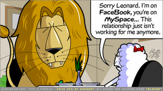
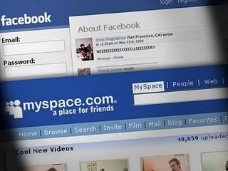
I always wonder how is the battle between Mark and Tom? Whose inventions are better? Facebook by Mark Zuckerberg or MySpace by Tom Anderson. Well, this week, bring to you a close up battle between Facebook and MySpace Part 1. I will be revealing this week three rounds of versus(s) between this two top rated Social Networking Sites.
Quick Fact- Facebook is currently having 150 million members while MySpace is having 191 million members. (Selfgrowth.com)
Layout: Indeniable, MySpace wins in this segment. According to www.techcrunch.com's Facebook Poll, only 5% of the nearly 800,000 respondents give the new layout of Facebook a thumbs up while rest go the other way. And MySpace offers layout design utilities which let users select options and preview what their page will look like.
Profiles: Draw. Because MySpace has a lot of customizations, but Facebook’s default looks better than MySpace’s and it’s very neat and well organized.
Profiles: Draw. Because MySpace has a lot of customizations, but Facebook’s default looks better than MySpace’s and it’s very neat and well organized.
Customization: MySpace and Facebook tie here. Facebook lets you add and remove applications, while MySpace lets you do whatever you want with the pages, only if you know a little HTML. Unfortunately thats the reason MySpace’s design is kinda messy and unorganized.
Site Organization: Both are quite organized. However, Facebook wins because of its clean layout that allows you to find everything right away, and it’s homepage is a link to everything you need in neat and tidy boxes.
Overall Site Design: Facebook is the winner for this round. MySpace might tend to look a little unprofessionally when compared to Facebook, mainly again because of it’s inconsistency in design. This time I guess its MySpace themselves, not the users, who make the site difficult to use.
Overall Site Design: Facebook is the winner for this round. MySpace might tend to look a little unprofessionally when compared to Facebook, mainly again because of it’s inconsistency in design. This time I guess its MySpace themselves, not the users, who make the site difficult to use.
Round Winner: *drum rolls* .....Its a DRAW!
Round 2: Media

(image obtained from www.vsteonline.ning.com)
Pictures: Facebook wins!! Don't you like it when you don't have to bring your own camera and all you have to do is to have a friend who owns a camera and a Facebook account like you? because of its well-organized picture section and the ability to tag people and have people tag themselves, Facebook definitely is the winner! Also, with the applications recently released you can now add Flickr and other photosharing site streams to your profile. However, Fox now owns Photobucket, which provides photo hosting to MySpace users.
Videos: This one is a tie because both MySpace and Facebook let you upload video and they both have their own flash player. MySpace will let you embed video into your profile but you can post videos to Facebook as well.
Music: MySpace wins. Most band owns a MySpace account and fan page. However, with the new Facebook apps you can add your data from music tracking sites like Last.fm and iLike: in fact the top application on Facebook at the moment is the iLike app.
Sharing: Now, Facebook’s advantage here is only a slight one. Facebook allows you to share media links very easily and i fact automatically though the Facebook feed, something that I’m sure many MySpace users would like to be able to do (MySpace News isn’t really suited to this). You can, however, grab embedded media like videos from other profiles to repost on MySpace.
Round Winner: Facebook!!
Round 3: Community
Relationships: I have to say Facebook did a very good job in building and gaining back relationship. With a click on your mouse, you can easily find your long lost friends back in high school or you can even indicate how you know a person. Even all mothers can easily check whether their son is dating a girl or not. *Worried!* while the features for MySpace in this segment is kinda limited.
Groups: Both sites have groups, but Facebook makes them more prominent. They are a bigger part of the service and there are a lot of people using them for clever uses like planning meet up and giving info to fans.
Keeping Track of What’s New: Facebook kills MySpace here. On MySpace the only way to know if a friend added something new to their profile is to go look at it, and the only way to know if you made a new friends is to look for the person. Facebook has two feeds. One tells you what’s new with you, like who accepted your friend request or your posted items, etc. The other feed tells you what’s up with all your friends, like who they added and what groups they joined.
Messaging: This is a tie. They both have a place where people can leave messages on your profile and they both have a basic mail system.
Co-Workers: Facebook can be used as a tool to talk to the people you work with also and see what’s new with them. You can even join a network for your company. MySpace was really designed for teens so it doesn’t really have these types of features.
Round Winner: Still... Facebook! *Applauses*
Summary for part 1 of Facebook versus MySpace: Looks like Facebook dominated the first part of the competition. Eventhough MySpace has the most members but it might not be the top rated Social Networking Sites. So based on the first 3 rounds, do you agree that facebook is better than MySpace? Tell me about it...
For more hyped up competitions between Tom and Mark, stay tune for next week's Facebook Vs MySpace Part 2. Ciao!
(Source of reference: Facebook Hammers MySpace In All Key Elements, Retrieved on 18th January 2020, URL- http://mashable.com)
Hugs,
Justin.

 Kuala Lumpur Time


Facebook is definitely a user friendly site. What I like most about it are the games provided in there. You can test your knowledge, typing speed etc with the games even though I have not been playing since months ago. =)
ReplyDeleteBy the way, where are the hyperlinks for the URLs? And I spotted some grammar errors:
"Facebook currently having 150 million members"
The word "is" is missing.
"onlif you know a little HTML." (Under Customization)
Shouldn't it be "only if you know"?
"and it’s start page is a link to everything you need in neat and tidy boxes." (Under Site Organization)
Is Homepage a better to use than start page? Just wondering. =)
thx jason for helping on the grammar n spelling check.. making the changes now.. thx! =) ur suppose to be sleeping now! =P
ReplyDeleteyea.. support Facebook all the time^v^..it is really a gud SNS=) and, i dun even have a MySpace acc... so sad for MySpace =P
ReplyDeleteMyspace is just sorta like another Friendster, many people joining it and clutter their profiles with animated glitter and microsized text while adding a huge library of friends that they never know.
ReplyDelete